Global Digital Transformation
- ux design
- ui design
- design system
- testing
- Sketch
- Invision
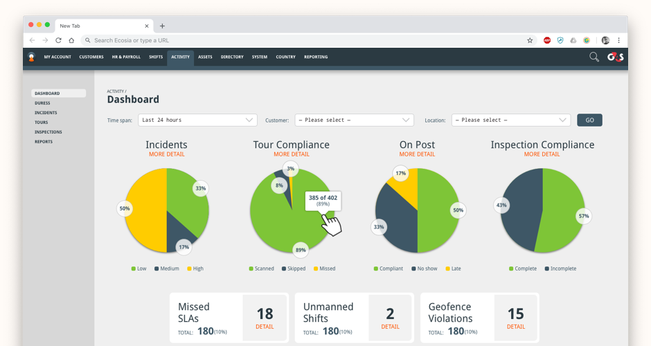 Clear and concise dashboards for control centre staff
 Moving from text based to visually based UIs for almost all day to day functions made user's lives easier
 Now users could see on specially created maps where people were and their routes
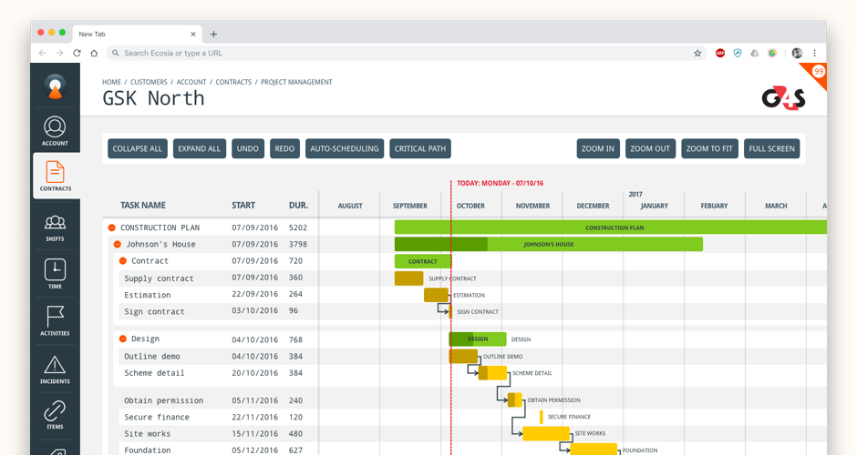 A custom project planning app was built into the system
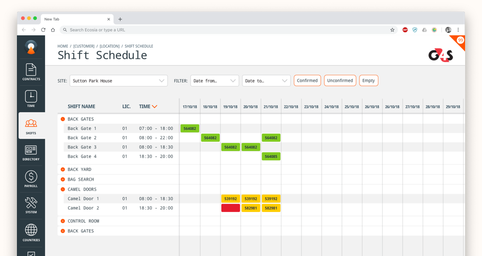
 Tables were key to a lot of journeys so we had to make them clear
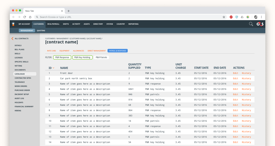
 Forms were also integral to how users moved through processes and we had to make the most of the screen real estate
Business Problem
As a symptom of how the company had grown, each country had its own way of working, its own third party packages to help facilitate that ranging from Excel spreadsheets to fully blown customised enterprise level software. This lack of continuity meant managing a global company very difficult and day to day tasks could only be performed by local employees. There was therefore a clear need to pull the many system and methods of working exhibited by countries together under a single new digital platform.
Design Process
Working as the sole output of UX and UI work, Clear January took over where there was previously a 50+ team to create a design system grounded in solid UX thinking working with highly knowledgeable subject matter experts from across the business. Initially, there was a huge job to get the existing design work up to scratch for the offshore team of developers to get moving on.
UX Journey Mapping and Prototyping
With the ground work done we were able to start to work through prioritised features and products in their own right. There was a number of products from HR management through project management to staff member geo-tracking products that needed to be built from the ground up. Working closely with subject matter experts we were able to workshop features and brainstorm ideas to create journey maps and prototypes to test with select users and frontline staff.
UI Design
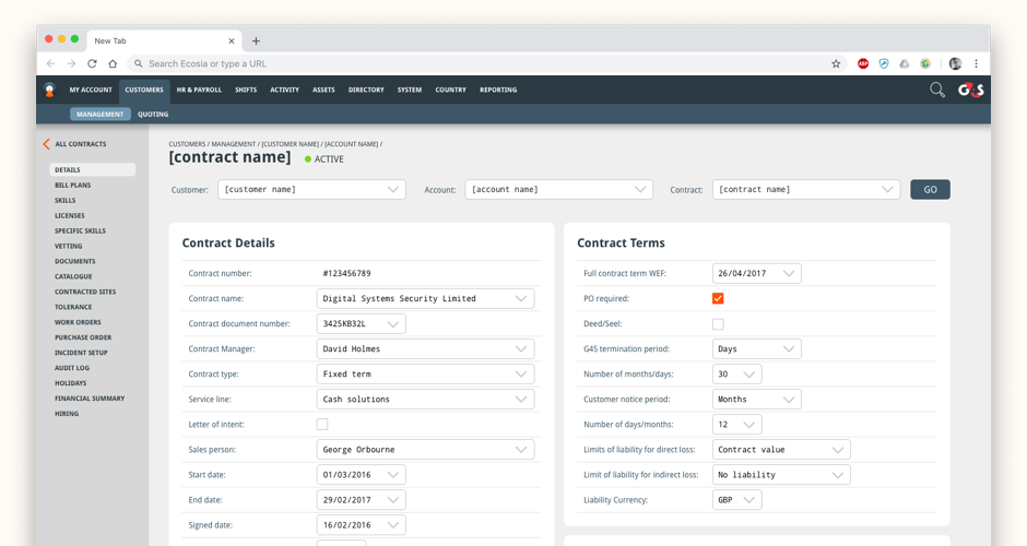
At the centre of the design system we created was the idea that users would be staring at these screens all day in long shifts. Rather than follow the brand colours of red, black and white with grey we moved to create a new palette that was easier on the eye. A suite of greys and blues were used to ease the strain on the eye through the day in the darker rooms the staff are used to. We then used orange as a highlight colour to make it clear where points of interaction were on the screen.
Dashboards, tables and forms made up a large part of what we created with visually based processes put in place of keyboard and text driven processes of the past. Dashboards were designed to be clear and concise with the ability to drill down to the details wherever possible. Forms were designed to make use of all the screen real estate the users had on their monitors and large portions of the work we did was specifically designed to work on certain desktop screen resolutions. Unusually, there was limited need to make the screens responsive!
The final iteration pictured above looked to revisit the UI with the aim of making it easier to use for the team and contract managers day to day with more screen real estate dedicated to content rather than navigation. The deep navigation always posed a problem so making it context driven whilst entirely accessible was a key aim in these later iterations.